

![[old] Flower Map Americas-1.png](https://images.squarespace-cdn.com/content/v1/5d3f40be1d7ae50001ce5e44/1667267451368-DZRV3R5ZJ5AWE77XHO6U/%5Bold%5D+Flower+Map+Americas-1.png)
![[top] B18-Model-1.png](https://images.squarespace-cdn.com/content/v1/5d3f40be1d7ae50001ce5e44/1667267471688-M0QF6I92K33LPG66F424/%5Btop%5D+B18-Model-1.png)
![[top] B19-Model-1.png](https://images.squarespace-cdn.com/content/v1/5d3f40be1d7ae50001ce5e44/1667267490409-J091300SQ7BKGTRHN2F4/%5Btop%5D+B19-Model-1.png)
![[top] B19-2-Model-1.png](https://images.squarespace-cdn.com/content/v1/5d3f40be1d7ae50001ce5e44/1667267507859-2HF6M6U3JQXPJ8J0NDT1/%5Btop%5D+B19-2-Model-1.png)
![[top] GoogleB3(2)-Model-1.png](https://images.squarespace-cdn.com/content/v1/5d3f40be1d7ae50001ce5e44/1667267528591-LJ8Z6YWWUW2CC0865PC0/%5Btop%5D+GoogleB3%282%29-Model-1.png)
![First [old] Treffoil Projection.png](https://images.squarespace-cdn.com/content/v1/5d3f40be1d7ae50001ce5e44/1667268035938-6BXYW8XO788VRDUFUN43/First+%5Bold%5D+Treffoil+Projection.png)


![[top] Matrix World Clock with Day and Night.png](https://images.squarespace-cdn.com/content/v1/5d3f40be1d7ae50001ce5e44/1667268073007-CS1HS1D8C6B2XWSU26RO/%5Btop%5D+Matrix+World+Clock+with+Day+and+Night.png)
![[old] UN in Heart Map.png](https://images.squarespace-cdn.com/content/v1/5d3f40be1d7ae50001ce5e44/1667268105809-5C6OUW2ZMSU8X7CD49PR/%5Bold%5D+UN+in+Heart+Map.png)
![[old] Oval Matrix Projection.png](https://images.squarespace-cdn.com/content/v1/5d3f40be1d7ae50001ce5e44/1667268123331-AD8ZNVQRAJY45V4AS225/%5Bold%5D+Oval+Matrix+Projection.png)
COMPARISONS OF COMMONLY USED WORLD MAPS TO OUR EQUAL AREA WORLD MAPS
How to present the surface area of the spherical earth on a two dimensional paper has challenged mapmakers for centuries. Although a world globe provides the only accurate portrayal of the spherical earth, it does not present the entire surface area of the earth at a glance. One can only observe half of the globe at any given moment; and only the portion right in front of the observer's eyes is true to the shape without distortion. The earth globe has to be rotated to see any other desired spots.
To be able to see all the land masses and waters of the world at a glance and compare relative sizes and distances between all parts of the earth including the nations and more, it became desirable, if not necessary, to create two dimensional world maps to be designed based on the knowledge that the earth is round. These new world maps began to appear in Europe as early as the middle of the sixteenth century. There are over 250 world map designs that have been invented and introduced during the last 450 years. However, the most commonly used world maps, in USA, are based on only two designs, the Mercator and the Robinson projections. Fig. 1 & Fig. 2.
The original Mercator projection was designed by the leading Flemish cartographer, Gerhardus Mercator in 1569. There have been many refinements, revisions and improvements made to the original design during the last four centuries. Nevertheless, it still remains as one of the most distorted world maps in use to this day.

Greenland, for example, appears larger than South America, although in fact Greenland is only 1/8 the size of South America. Alaska and Brazil look about equal, but in reality, Brazil is nearly six times the size of Alaska. If the area of the earth is drawn to scale along the equator of the Mercator projection, the total surface area of the earth then measures to be 3.14 times larger than it actually is on the earth. The reason for the distortions is that Mercator chose to present the meridians as equidistant vertical parallel lines, whereas the meridians merge to a point on each pole, north & south. This rectangular grid was useful for charting navigation routes on high seas, but added vast surface areas between the meridians, causing extreme distortion of sizes of land masses and seas especially near the polar regions. (Fig. 1)
The original Robinson projection was designed by Arthur Robinson in 1963 and was chosen as the official world map of the National Geographic Society in 1988. It was the winning design out of 20 submitted projections. It has been refined and revised somewhat now and then but still remains close to the original design.

The Society has introduced more current versions, some with curved parallels to reduce distortions. Although the Robinson projection is a better presentation of the spherical earth than the Mercator family of rectangular projections, nevertheless, it is not free of gross distortions, specially around the polar regions. Also, if the area along the equator is drawn to scale, the total surface area of the earth then measures to be 1.38 times larger than the true area of the earth, so it is not an "equal area" world map. (Fig. 2.)
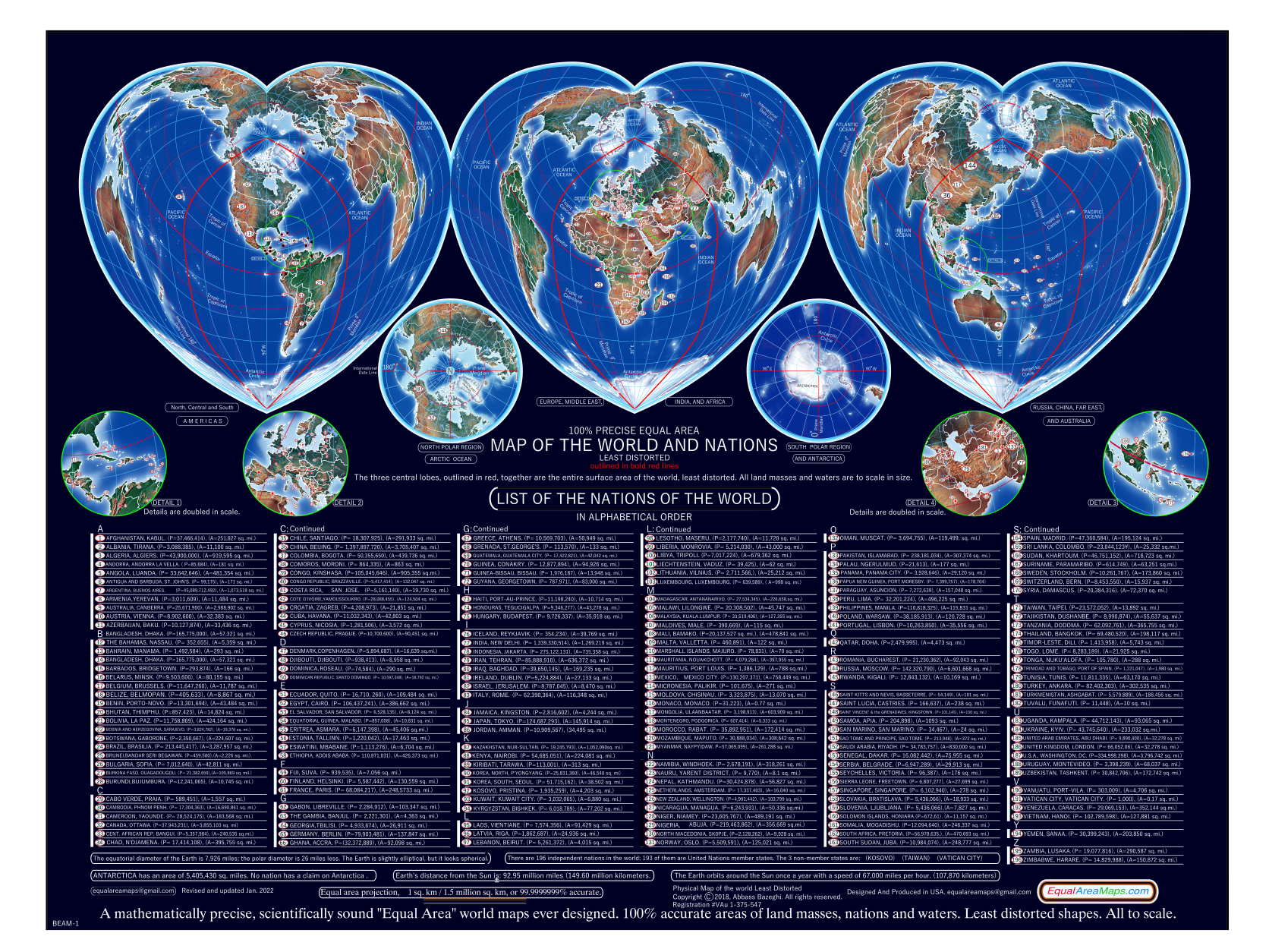
World map designs have continued to happen for about 450 years and the search for the ultimate world map design still continues. Ideally, a two dimensional map of the world should be an "equal area" map, also reflecting the earth's roundness and presenting the commonly known standard grid of the meridians and parallels while showing the actual shapes and sizes of the lands and seas to achieve "equal area" status, where all lands and seas are presented true to scale in relation to each other. Our "equal area" world map projections are among the most accurate, least distorted "equal area" world map projections ever designed. It is the result of 22 years of time and the design of 16 previous "equal area" projections.
In projection 14, by interrupting along political lines, Russia and China's shapes and true sizes are better presented and easier to comprehend. Also the overall shape of the design is organic and indicative of the surface of a spherical earth; even a child can visualize how this map may fold, in the mind's eye, into a spherical globe. These original designs are new points of view that make geographic visualization and education easier.
The geometry of the 15 degree grid of parallels and meridians are designed and perfected to plus/minus one sq. mile per one million sq. miles using AutoCad of AutoDesk in a dwg. file. This file is imported to ArcMap, saved in geodatabase. The code is written in Python to import geographic data and raster images into the 15 degree grid of all our "equal area" projections.

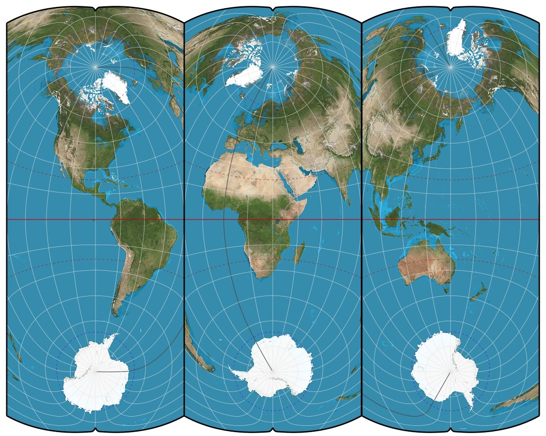
The meridians on the earth merge and end on the poles as shown in Sinusoidal projection (Fid. 3). In Mercator projection, the meridians are equally spaced as parallel lines. This causes extreme distortion of the areas starting above and below the equator and reaching the maximum distortion on the poles. The distances between the parallels are adjusted to prevent extreme distortion of the shapes. The Robinson projection allows the meridians to curve and merge along an arbitrary line about half of the length of the equator line; the parallels are spaced such that to minimize distortion of the shapes of land masses and seas.
The Sinusoidal projection is a mathematically precise "equal area" world map. It is occasionally used by NASA & other scientists for presenting statistical information where the true sizes of materials being presented are intended to be shown to scale. However, because of its extreme distortion starting from the equator and increasing as the meridians approach the north and south poles, it is not used much by the general public as a viewing map. It is brought in here to show the actual true size of the earth in comparison to the distorted sizes of the areas of the Mercator and Robinson projections. (Fig. 3)